Monday, November 30, 2015

Research : Magazine Logos

Deciding a logo for a magazine may be a changing process.
Some magazines improve their logos by using different color schemes, different fonts and so on.
Here is a quick comparison of the changes in the logo design of Rolling stones magazine from their first edition, published in 1967 to the logo today.


They brought about a new logo in the late 1970s- early 198s.


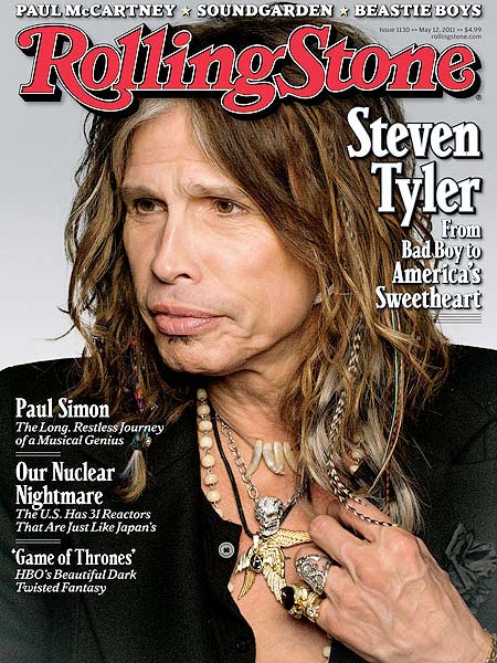
Recently it can be seen that they have further improved the font of the logo and keep it a solid Red color now. The mast head is behind the picture of the celebrity in many cases.


Friday, November 27, 2015

Research: Fonts and Logos

 Different magazines go with different fonts and color schemes in terms of their genre.

Most music magazines may be a clear give away of the genre they are trying to portray just by the title alone,so it is important to go with a font that is effective and understood by audiences.

For example, Rolling Stone, based on the idea that it was named after a Bob Dylan song as well as the music band, The Rolling Stones, it is seen as a music genre magazine. It also features politics, pop culture, rock, pop, R&B music and what not and the red color of the logo connotes excitement and energy and is eye catching and is a sort of Serif font to show some formality.
 . 


   Smash Hits is aimed at children and young teens. This is sort off a comic sans serif style of font which is stereotyped as a "child like font" to help the teens and children understand the soft, casual font rather than formal, cursive, serif fonts.

The bright colors used give off a nice, fun and friendly vibe,  which may help to attract the target audience.


Thursday, November 26, 2015

Research : Screen Resolution and Color

Screen resolution is the number of pixels. An image is built up from many pixels. 
The screen creates the image you see by changing the colors of these tiny square elements.

The screen resolution tells you how many pixels your screen can display horizontally and vertically.

300 pixels per inch is a standard size for printing in a magazine, but since we are using web images so 72 pixels per inch of resolution would be acceptable.


The two basic combination of colors that we use for printing are;


RGB: Red, Green & Blue — The RGB color model is an additive color model in which red, green and blue colors  are added together in various ways to reproduce a broad array of colors. The name of the model comes from the initials of the three additive primary colors.


CMYK: Cyan-Magenta-Yellow-Black — CMYK is a color model in which all colors are described as a mixture of these four process colors. CMYK is the standard color model used in printing for full-color documents. Because such printing uses inks of these four basic colors, it is often called four-color printing.

As we will not be printing the final product we will use RGB instead of CMYK which is originally used for printing.

Saturday, November 21, 2015

Research : Fonts

In today’s technologically advancing era, people are aware of typography, design and how the world looks around them.

There are an overwhelming amount of fonts at our fingertips, but first let’s talk about the main categories of fonts out there.
Serif: Serif is the slight projection at the end of a stroke that’s most commonly seen at the bottom of letters. If you look closely, some fonts will have “little feet” on them. This is what characterizes it as being a Serif font. This allows the eye to flow through sentences with ease.
Sans Serif: Fonts that are Sans have no “feet,” or serif.

An example of these can be seen below;


Typography can be quite influential on the audience of both online and written media , and can have a positive effect when done correctly. The first thing that typography does is draw people in and express a general feeling about the content that a user is about to read.
Serif fonts are easier to read in printed form as it makes the individual letter more distinctive and easier for our brain to recognize easily.
However, sans Serif fonts are better for websites and online use. It is also better for children who are learning learning to read as the simplicity of the letter shapes make them easily recognizable.

In the words of Jessica Hische, a well-known and respected letterer, illustrator and blogger:“Typefaces definitely have personalities…I usually want something even-tempered and laid back but not lacking in personality."

This is the same ideology I want to implement in my magazine. As it is a generally youth targeted magazine, I want to have a laid back but professional look.

Wednesday, November 18, 2015

Research : Magazine Layouts


The front cover should be something that highlights the artist/band as well as the magazine and its logo itself. 
These are some of the inspirations for what I would like my magazine cover to look like, in terms of camera angels, shots, lighting and mise en scene.


Monday, November 9, 2015

Preliminary Task : Editing and the Final Product


Out of all the pictures taken for the project, I used the one I thought was the closest to the actual poster.

I used Adobe Photoshop to adjust the brightness and over all edit the picture and add the Dexter logo along with the tagline.


Thursday, November 5, 2015

Preliminary Task : The Shoot


Preparations for the shooting for the Poster Task


I was in charge of making the wings which I did with the help of red and black poster paint. I also held up the spotlight to try and recreate the same lighting effect as seen in the actual poster.

Hassam was our model, he had to wear a blue shirt and hold a knife in his hand, similar to the way seen in the poster.

Hamna was the one who took the main pictures while Nurain was in charge of all the backstage action.


Monday, November 2, 2015

Preliminary Task : Poster


Poster Task and Analysis

The poster we have to recreate is the official poster for the 6th season of the American television crime drama mystery series DEXTER.

The picture is a portrait mid- shot of the main character; Dexter Morgan in front of a white backdrop with angel wings made out of splattered blood.
The lighting is from a high angle, focusing mainly on the left side of the character's face.