Saturday, April 30, 2016

Double Page spread : Process

I decided to go with this picture for the double page spread.


 I started out by initially editing the picture to fix the brightness, contract and do a little color correction


I then added the main heading that was "From School to the Stage"
I chose the same font as I used on the cover to write out the band's name


I also decided to highlight a quote to make the double page spread look more authentic as I had seen in some of my inspiration spreads.


I decided to change the color from red to yellow and place it in the bottom left corner of the double page spread.


I then added a tagline under the heading explaining a gist of what the article will be about 


After this I added the article and highlighted the band name, and the names of the members.


Wednesday, April 27, 2016

Monday, April 18, 2016

Content Page Revisions


This was initially my content page but I edited it further and decided to use the new one as my actual content page.


I then decided to fix the editor's note and add a little color so it does not look very bland 

I went with the color scheme of the cover which was Red and Yellow.


Tuesday, April 12, 2016

Content Page: Designing and Editing

I wanted to incorporate an image in the magazine's content page regarding the cover, i edited and put this picture in the magazine. 


 I used the san serif font KG Irregular Solid for most of the content page.

I put the magazine acronyms as well as the month and year of the issue on the top left corner.


. I used the fx options such as Stroke, Drop Shadow and Inner/ Outer Shadow to make the headings such as CONTENTS stand out more.


I decided to go with bright colors such as Red, Yellow and Green to make it more eye catching for the target audience.


According to all the articles i want to feature in my magazine, I put the page number next to the heading of the article.
I also added a little preview  for some of the articles and used a different color for that subheading to make it stand out .

The cover story is put in a box to show some significant importance so that the reader understands that it is the main story.


As it is a monthly magazine, I increased the number of pages and added more content.


I also added an informal editors note to show some interaction between the magazine editors and the audience and also to add some news about new articles and encourage the readers to be more interactive.


I then decided to add something extra to mention that there will be free posters inside.
Although it is mentioned on the cover of the magazine, this will be a sort of reminder for the reader to see that free posters are included when they flip open the magazine to read the contents.

I downloaded some stars and banners from all-free-download.com and with the help of Adobe Illustrator I added it to the content page.


After adding some text and applying drop shadow and red stroke to both the shape and text, my content page was complete.


Monday, April 4, 2016

Construction: Front Cover

I have chosen to go with the indie genre photo shoot.

As for magazine sizes; they normally come in two sizes: 7"10" or 8"11". my magazine inspirations include Rolling Stones, Classic Rock, Alternative Press, Rock Sound etc and they use 8"11" so that is what I am going for as well. 


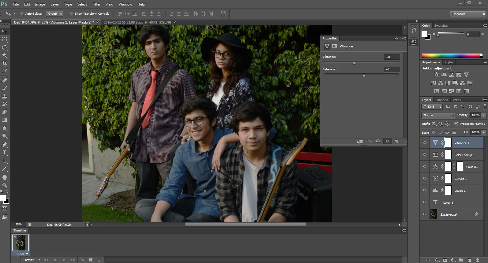
I opened this image with Photoshop and adjusted the brightness, curves, colors of the picture.


The I added the Logo of my magazine and initially I had gone with the Font ELEPHANT for my logo but as it was not very visible I decided to change it.


I decided to use the font Bright Young Things for the magazine Logo.
The Band name ; The Cassettes is in the font Gravity of Love. 


This seemed  too dull so I decided to change the color scheme to red and yellow.
I changed the font of the Band name to TypoSlab Irregular.
I added the date of the issue under the logo.


The tagline is the same font as the band name but I switched the color to emphasize the  
I tried to highlight the genre and so I used the font Broken Stick for Indie pop.


The sell lines for other stories in the magazine vary in color to catch the audience's attention and give the magazine a informal but eye catching look to the target market.


I added a bar code as per codes and conventions of any magazine


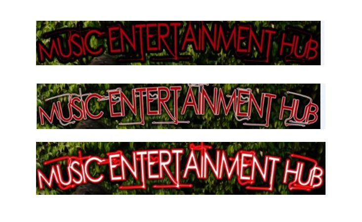
I changed the colors and outline of the masthead (using Stroke from the fx option)  to whatever looked the most eye catching. I settled for white Text and a red outline along with other minor adjustments such as drop shadow, inner glow and so on.

Finally, I added a skyline to add other features of my magazine to attract my specific target audience to buy the magazine